Brand Guidelines
How SoundCampaign looks, sounds, and feels
A reference for color, type, logo usage, and voice for anyone representing the SoundCampaign brand, internally or as a partner.
Color
Palette
A near-black canvas with a white primary action and a single high-signal green accent. Every other color is a shade of surface or text.
Background
#000000 · --background
Deep page base
Surface
#121212 · --surface
Hero gradients, footer, primary cards
Surface 2
#1c1c1c · --surface-2
Raised cards, FAQ rows, stats
Surface 3
#262626 · --surface-3
Hover states, inset panels
CTA
#ffffff · --cta
Primary action buttons
CTA Hover
#d9d9d9 · --cta-hover
Button hover / pressed state
Brand
#00e676 · --brand
Links, highlights, accents
Brand Dark
#00c464 · --brand-dark
Accent hover / pressed state
Gold
#ffce00 · --gold
Trustpilot stars, rating accents
Foreground
#ffffff · --foreground
Headings, primary text
Muted
#b3b3b3 · --muted
Secondary / supporting text
Typography
Type pairing
Switzer carries the personality in headlines; Inter keeps body copy and UI clean and legible.
Display / Heading
Aa Bb Cc
Switzer · 400–900
Used for every headline, section title, and stat number across the site. A neutral geometric grotesk in the spirit of Spotify's in-house type.
Body / UI
Aa Bb Cc
Inter · 400–700
Used for body copy, form labels, buttons, and navigation. Optimized for legibility at small sizes on dark backgrounds.
Logo
Logo usage
The wordmark should always have room to breathe and stay legible against its background.






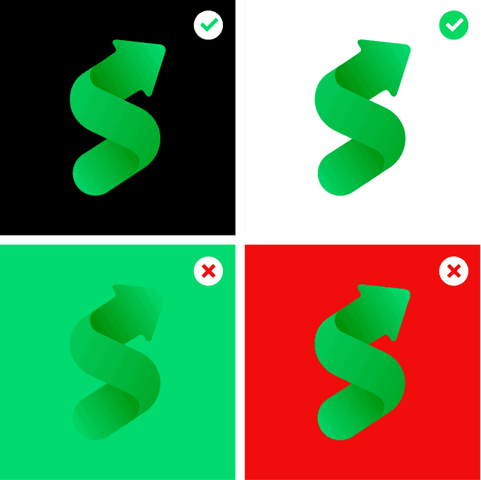
Background contrast
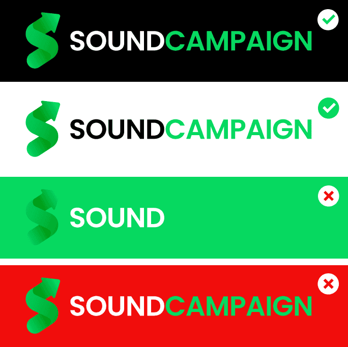
Lockup & color
Keep clear space around the logo of at least the height of the mark on every side.
Use the full-color wordmark on black or white backgrounds.
Don't place the icon on brand green, red, or any other saturated color.
Don't crop the wordmark down to a single word.
Don't recolor, rotate, stretch, or add drop shadows to the wordmark.
Don't recreate the logo in a different typeface. Always use the original file.
Voice & tone
How we sound
Whether it's an email, an ad, or a landing page, SoundCampaign's voice stays consistent.
Direct
We say what we mean. If a feature saves an artist time or money, say exactly how.
Honest
We never promise fake streams, bots, or guaranteed placements. If something has limits, we say so.
For artists, by artists
We write like a musician talking to another musician, not a corporate promo desk.
Encouraging, not salesy
Confident and warm, never pushy. We're rooting for the artist's next release, not just closing a sale.